← Back to Work
ENTERPRISE PLATFORM · CLOUD DATA OPS · INTERNSHIP

Platform
Operations Portal

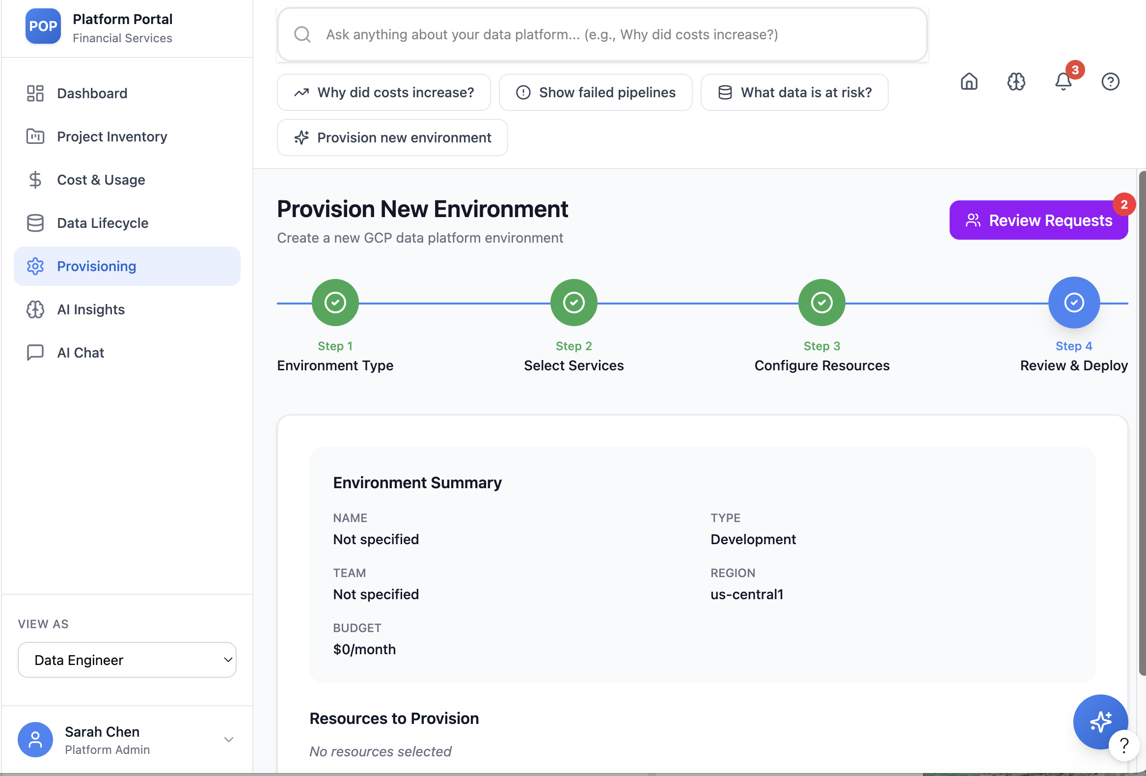
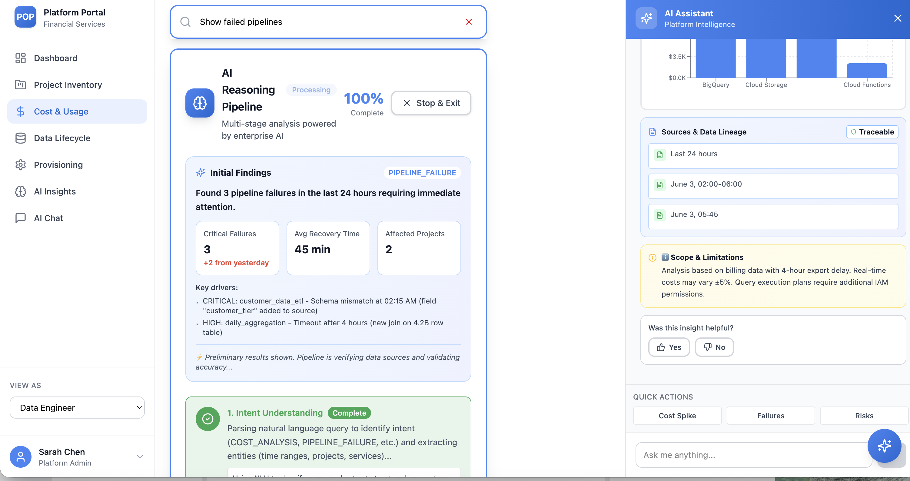
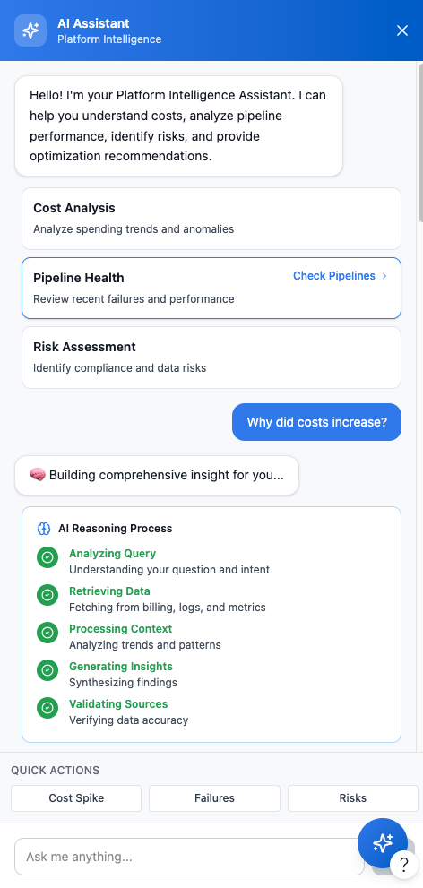
One intelligent entry point that turns a fragmented stack of cloud-platform tools into a single, calm command center — for engineers and non-technical teams alike.

ROLE
UX Design Intern
TIMELINE
June 2026
TYPE
Enterprise web platform
PLATFORM
Cloud data operations
Platform Operations Portal dashboard

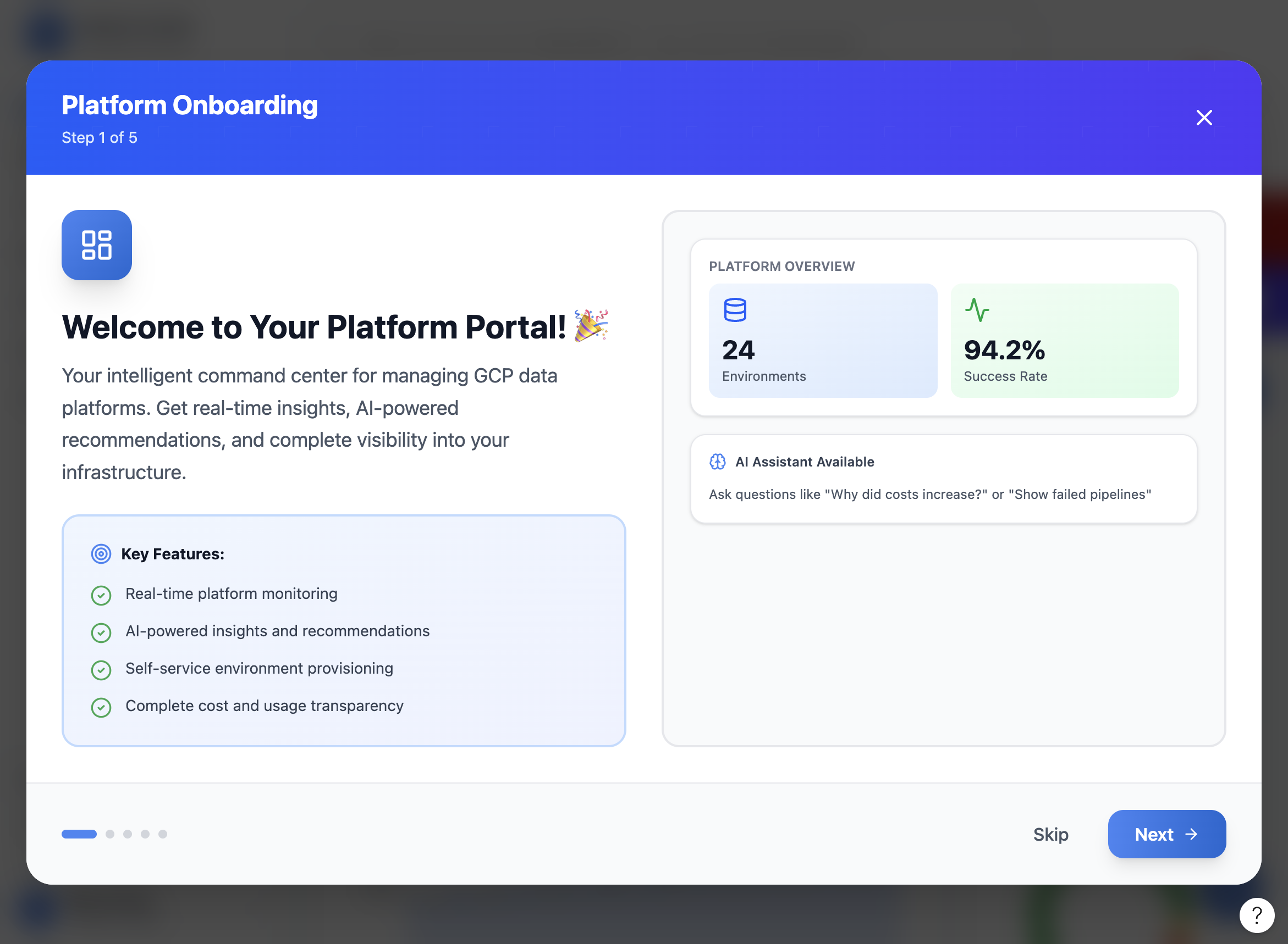
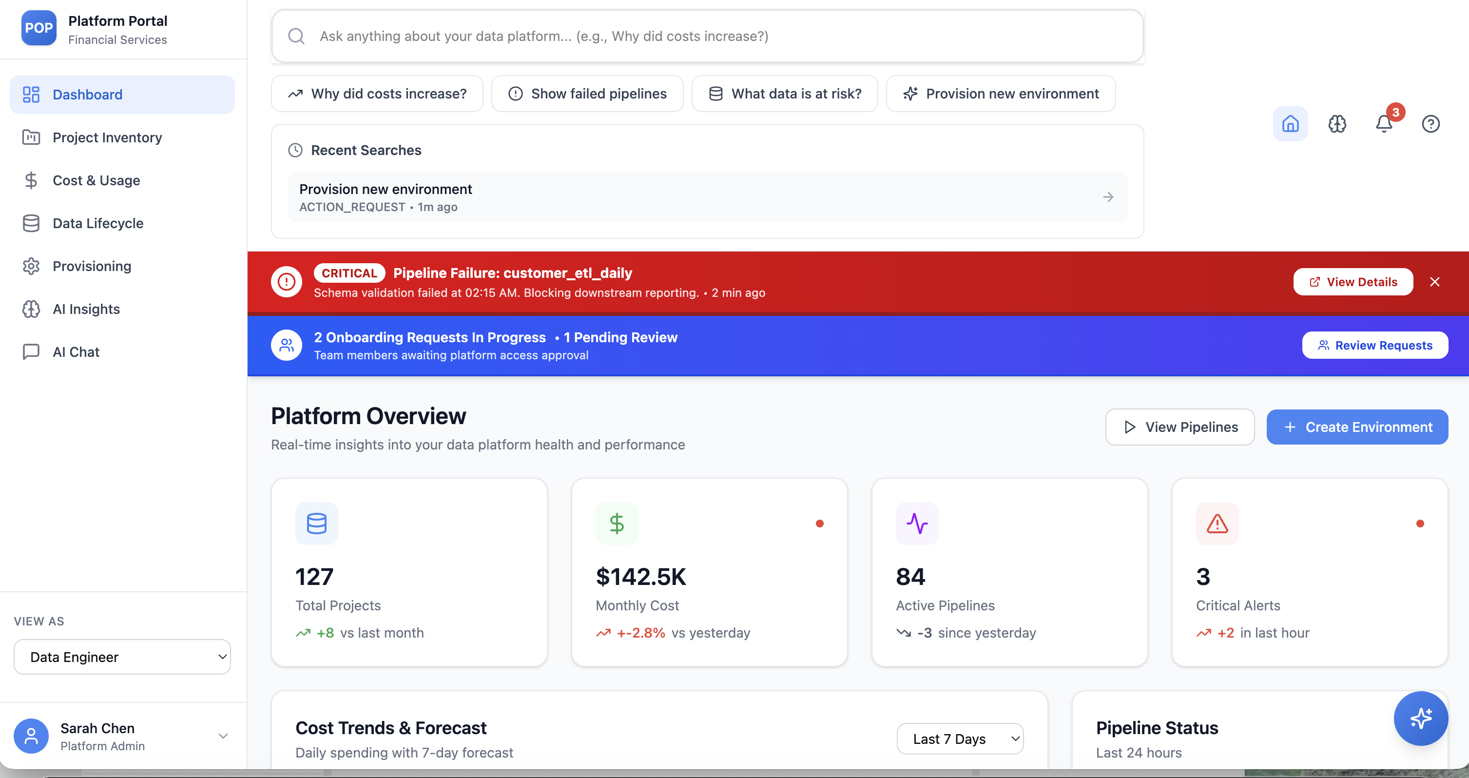
The Platform Overview — health, cost, pipelines, and alerts in one glance.

00 — OVERVIEW

A single, intuitive front door to a complex cloud data platform.

During my internship I helped design the Platform Operations Portal (POP) — a centralized interface that lets teams monitor health, track cost, manage data lifecycle, and provision environments without leaving one screen.

THE OBJECTIVE

Design one entry point to monitor usage, track costs, manage workflows, and provision environments.

THE PRODUCT

An enterprise portal serving both technical and non-technical users — usability and clarity first.

MY ROLE

UX design intern — dashboard, provisioning flows, reviewer system, alerts, and an AI interaction layer.

▶ THE WORKING PROTOTYPE

See it in motion.

A quick walkthrough of the working prototype — the dashboard, guided provisioning, and the AI interaction layer in action.

platform-operations-portal · prototype demo
Drop your screen recording here
Save it as pop/prototype-demo.mp4, then set HAS_VIDEO = true in the page script.

A short walkthrough of the working prototype.

01 — THE PROBLEM

Too many tools, not enough clarity.

The existing ecosystem relied on multiple fragmented tools — leaving users with limited visibility and a maze of systems to cross.

Troubleshooting was slow, decisions stalled, and almost everything depended on deep technical expertise.

THE CORE TENSION

"Users shouldn't need to understand the system to use it effectively."

01

Limited visibility

No single place to see platform activity, health, or spend.

02

Complex navigation

Insights and actions were scattered across disconnected systems.

03

Slow decisions

Troubleshooting and approvals dragged, bottlenecked by technical experts.

02 — MY CONTRIBUTION

What I owned as a UX design intern.

I focused on turning sprawling operational complexity into clear, guided experiences across five areas of the portal.

01

Centralized dashboard

A consolidated overview of platform health, cost, and activity.

02

Provisioning workflows

Step-by-step environment provisioning and approval flows.

03

Team-based reviewers

A reviewer-selection system that routes requests to teams, not individuals.

04

Notification model

A structured alert & notification system that surfaces what's critical.

05

AI interaction layer

A prompt-based search that answers questions and triggers actions.

03 — KEY DESIGN SOLUTIONS

Five moves from fragmented to cohesive.

Each solution removes a layer of friction — consolidating tools, adapting to roles, and guiding users through the hard parts.

01

A unified platform experience

One dashboard brings together project inventory, cost & usage insights, and pipeline status — replacing a stack of disconnected tools with a single source of truth.

Unified dashboard — platform overview
02

Role-based experience

A "View as" model tailors the interface to engineers, analysts, product owners, and governance users — each sees the information and actions relevant to them, nothing more.

Role-aware onboarding
03

Guided workflows

Complex tasks like environment provisioning become a calm, four-step flow — Environment Type → Select Services → Configure Resources → Review & Deploy — with clear progress and sensible defaults.

Provisioning step 1 — environment type Provisioning step 2 — select services Provisioning step 3 — configure resources
Environment Type Select Services Configure Resources Review & Deploy
04

Organization-aware review system

Instead of chasing individuals, users select reviewers by team or role, send requests to a group, and track approval status clearly — so nothing stalls on one person's inbox.

Review and deploy summary with reviewer requests
05

An intelligent interaction layer

A prompt-based assistant lets anyone ask in natural language — "Why did costs increase?", "Show failed pipelines" — and get traceable, sourced insights, with the option to trigger actions right from the answer.

AI reasoning pipeline with traceable sources AI assistant panel
TRUST, MADE VISIBLE

Every AI insight is "Traceable" — showing its sources, data lineage, and scope & limitations, so users can act on it with confidence.

04 — IMPACT

From fragmented to cohesive.

The design set out to make platform operations visible, faster, and approachable — for experts and newcomers alike.

↑ VISIBILITY

One clear view

Consolidated visibility across platform operations, replacing constant tool-switching.

→ SPEED

Faster decisions

Guided flows and AI insights shorten troubleshooting and approval cycles.

◇ ACCESS

Lower barrier

Simplified onboarding makes the platform usable for non-technical teams.

05 — LEARNING & OUTCOME

Designing for enterprise means balancing complexity with clarity.

The biggest lesson: users should never need to understand the system to use it effectively. Every flow had to hide operational complexity while keeping people in control.

The final concept transformed a fragmented experience into a cohesive, scalable, and user-friendly platform — supporting both operational efficiency and long-term adaptability.

Note: Based on work completed during an internship. Specific organizational details have been generalized to maintain confidentiality.