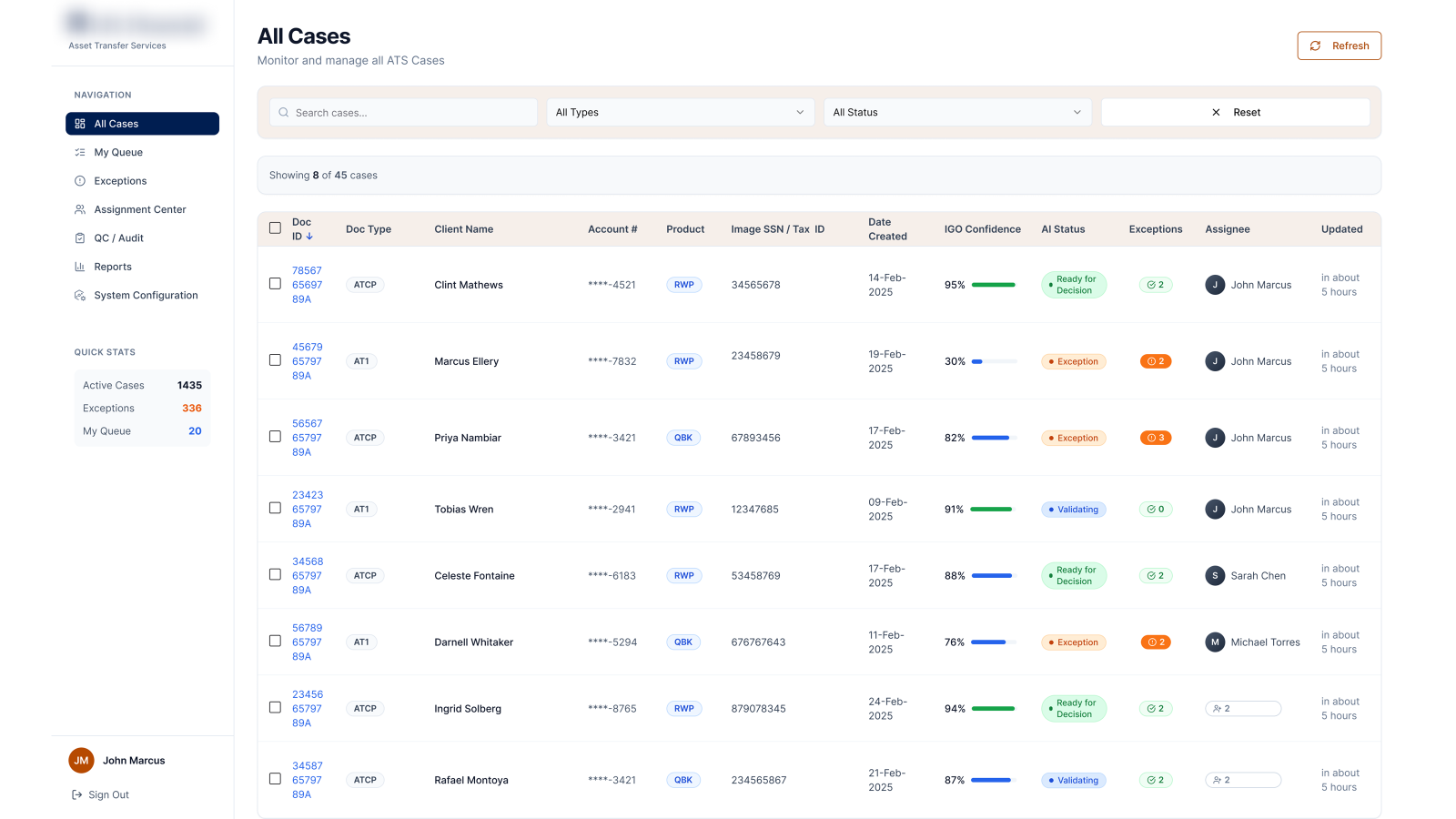
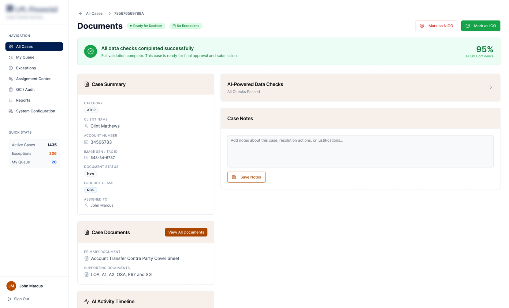
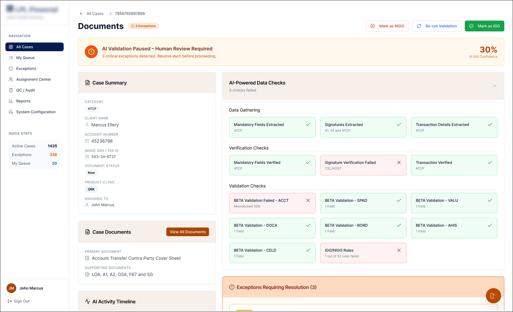
An AI-assisted operations console for asset-transfer teams — turning a wall of cases, checks and charts into clear, glanceable signals that show what's stuck, why it's flagged, and what to act on next.
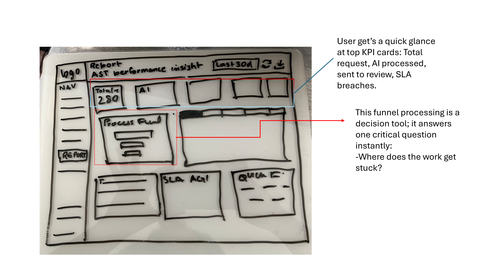
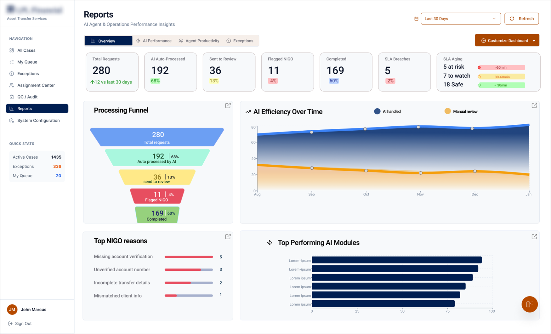
The redesigned Reports tab — built so a manager reads the whole operation's health in seconds.
Asset-transfer ops run on a 3-day SLA clock. I designed a console where AI processes the routine cases, flags the risky ones, and a manager can read the health of the whole operation in seconds, not minutes.
My first internship project: rethink how an asset-transfer team monitors work — starting with a Reports tab nobody could read at a glance.
An AI-assisted ops console: case queue, document validation, exception handling, smart assignment, and a glanceable insights dashboard.
It moves the team from reacting to raw data to acting on clear signals — catching SLA risk before it breaches.
Every case is a real client's assets leaving an account. Teams process hundreds a day across four legacy systems, under a hard 3-day SLA — and the tools showed them data, not decisions.
When a delay surfaced, it was often too late to act. When the AI flagged a case, no one could see why.
move through four legacy systems every cycle — under a hard 3-day SLA, where one missed exception becomes a financial error on a real account.
Reports were a wall of charts. Managers had to interpret trends by hand just to find what was urgent.
By the time a delay showed up on a dashboard, the case was already close to breaching.
Processing one transfer meant swiveling between four legacy systems to verify documents and accounts.
The console had to give a manager altitude and a processing agent precision — without drowning either in detail.
Research kept pointing to one truth: Marcus didn't need more data, he needed fewer, clearer signals. These were my guardrails.
Lead with a number and a status, not a graph someone has to interpret.
Make SLA aging and exceptions impossible to miss — before they breach.
Auto-process the clear cases; route the rest to a person, with reasons attached.
Every AI flag shows the failed check and why — no black-box rejections.
I knew almost nothing about asset transfers on day one. So before I touched Figma, I went and sat with the people who do this work — and let what I heard shape every screen.
Marcus oversees a team of analysts under constant SLA pressure. Two questions told me everything about where the product was failing him.
Q · Describe your role and a typical day.
"I make sure transfers process smoothly and on time — I monitor workload, watch SLA performance, and try to spot problems before they escalate."
Q · How do you monitor performance today?
"I check volume and what's pending, whether anything's near breaching SLA, whether the team's overloaded. Right now I look at different reports and tools — it's not always clear what needs attention, so I spend more time piecing information together."
"Too much data, not enough clarity."— the line that became my design brief
Across the interview and follow-ups, the same frustrations kept surfacing — so I grouped them into the themes that drove the redesign.
Delays and SLA risk surfaced too late — after the window to act had closed.
Nothing showed where in the pipeline work was actually getting stuck.
Charts everywhere, but no signal for what needed action right now.
Reassigning work and finding the right number meant digging through multiple views.
Before pixels, I sketched the tab around a single job: answer "where does work get stuck?" in seconds. The layout fell out of that question.
I pressure-tested the design against Marcus's real routine — the shift was from interpreting data to acting on it.
Before hi-fi, I mapped the end-to-end case flow — where AI acts, where a human steps in, and how the whole pipeline stays observable. Every screen I designed traces back to a node here.
A client's assets are queued to move out, across one of four legacy systems.
The agent reads documents and validates account data, running three check layers.
High AI confidence — nothing flagged.
Jim does a quick confirm; case is cleared.
Shows exactly which check failed and why.
Jim resolves the exception, or marks Not In Good Order.
Distributes and reassigns cases across the team — by SLA, workload and AI suggestion.
Watches the whole pipeline at a glance — SLA aging, the processing funnel, and top NIGO reasons.
From the agent clearing a single case to the manager reading the whole room — four moments that show the system working.
Every case leads with AI confidence, status and open exceptions — so an agent knows where to start before opening anything.

When every check passes, the case is marked ready for decision at high confidence. The agent confirms instead of re-deriving the work.

When checks fail, AI pauses and hands off to a human — showing exactly which verification failed and why. No black-box rejection.

KPI cards lead with a number and a status. A processing funnel answers "where does work get stuck?", and SLA-aging bands flag risk before it breaches.

The redesign gave the team a console that reads like a decision, not a database — and gave me my first taste of shipping research-driven design.
KPI cards plus status let a manager read system health at a glance instead of interpreting charts.
SLA-aging bands surface at-risk cases while there's still time to act on them.
Every flag shows the failed check, so agents act on the AI's verdict with confidence.
My first project taught me that clarity is a design decision.
Coming in, I wanted to show range — more charts, more views, more proof I'd worked hard. Research flipped that instinct. Marcus didn't need more data; he needed fewer, clearer signals. The most valuable thing I added to that Reports tab was restraint.
If I picked it up again, I'd usability-test the funnel with real managers and design the empty and error states — the moments a dashboard usually forgets, and where trust is quietly won or lost.