← Back to Work
ENTERPRISE AI · FINTECH · 0→1 CONCEPT

Data
Workbench

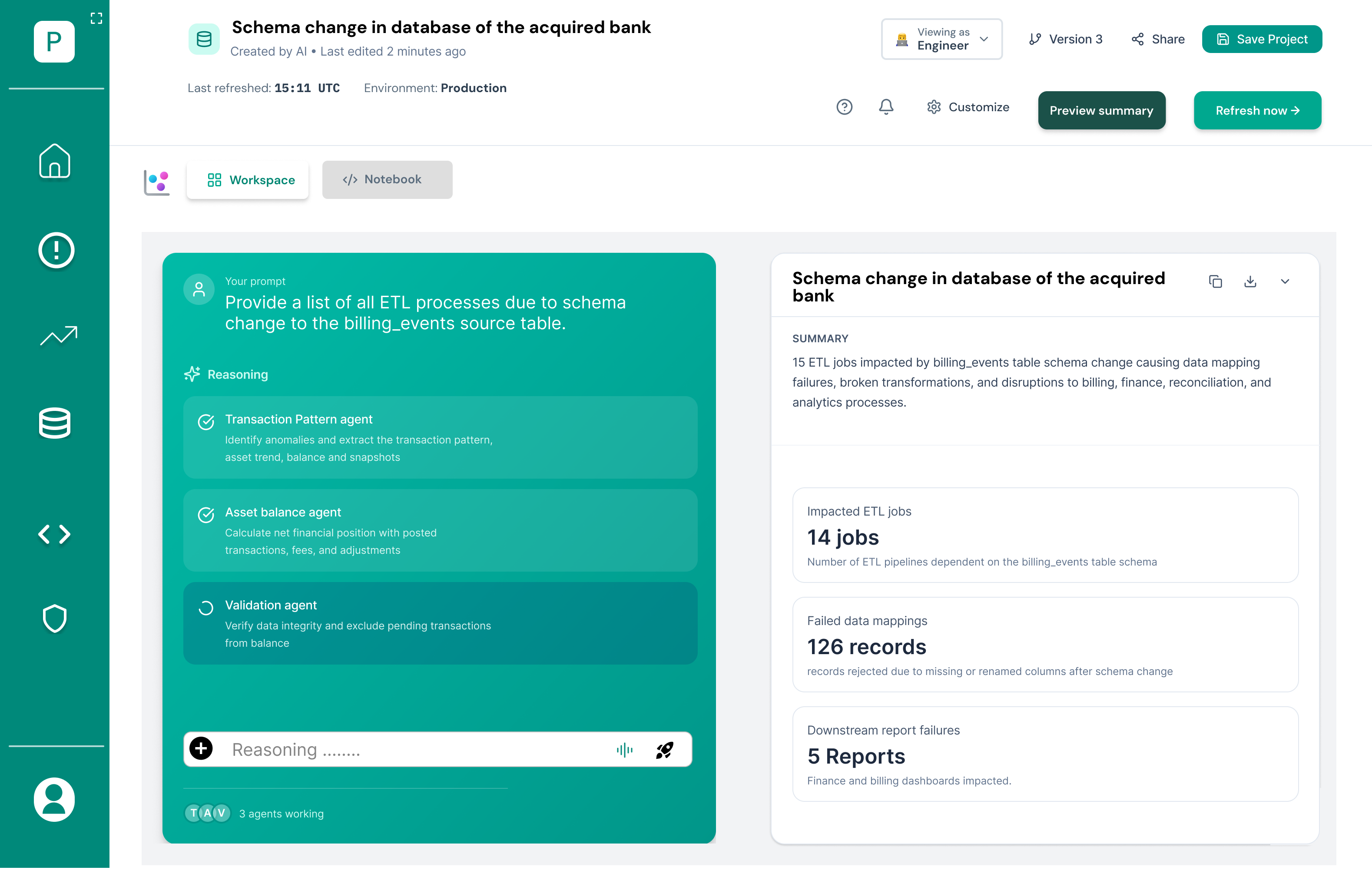
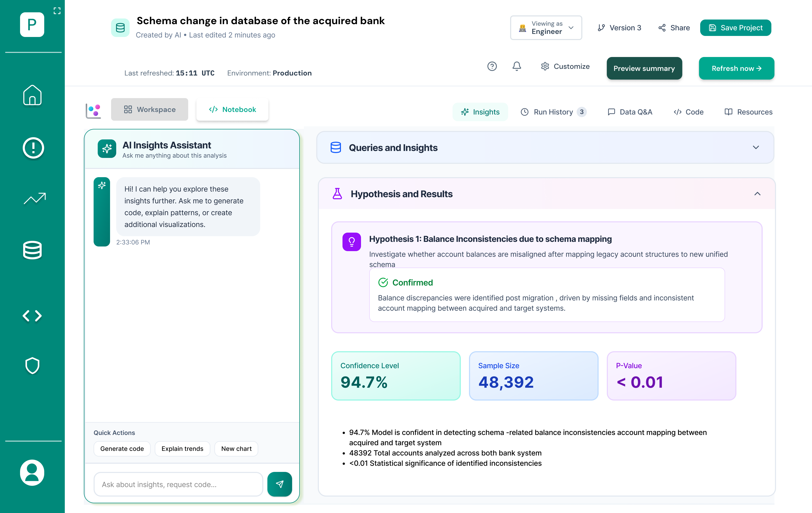
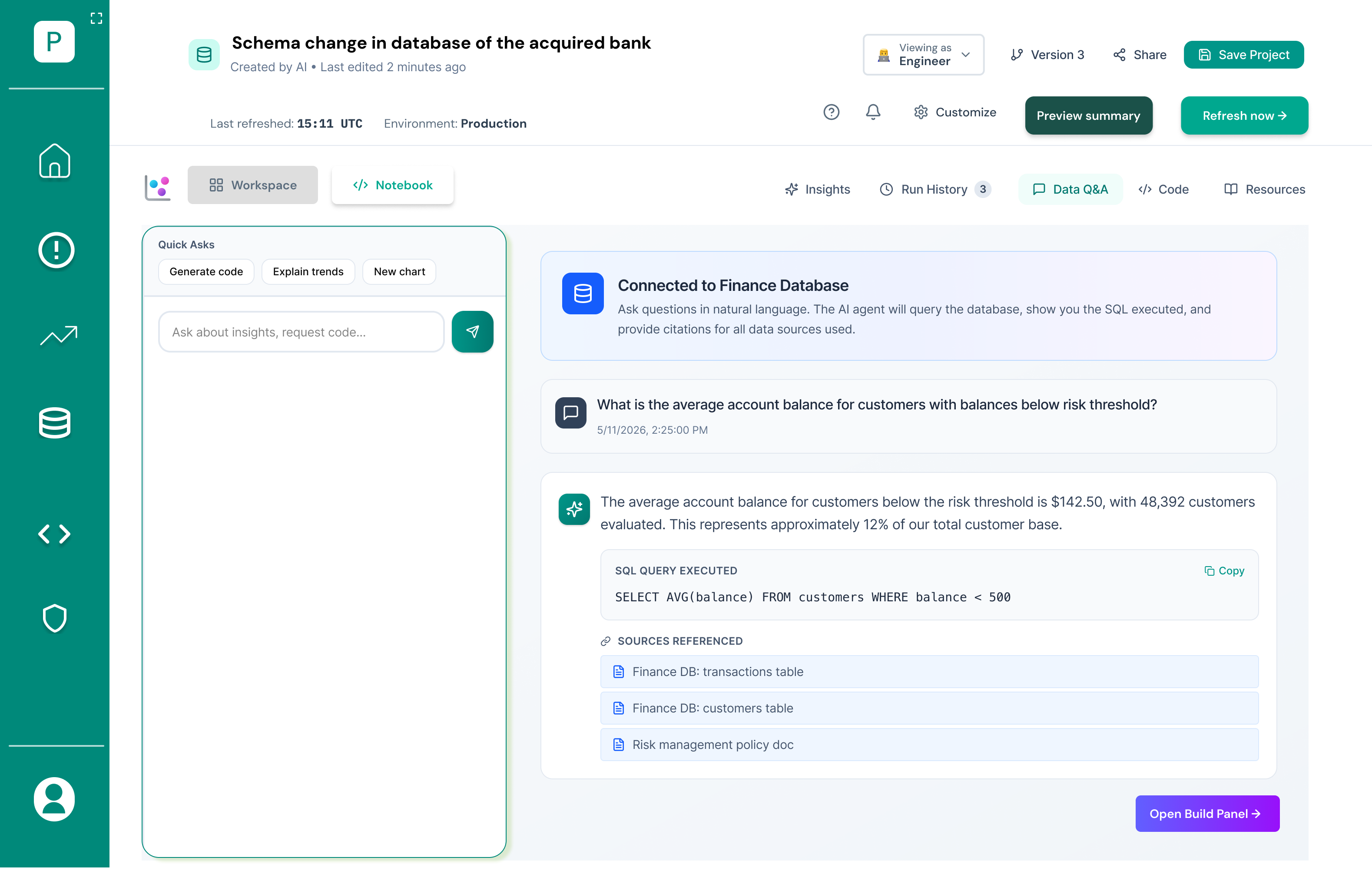
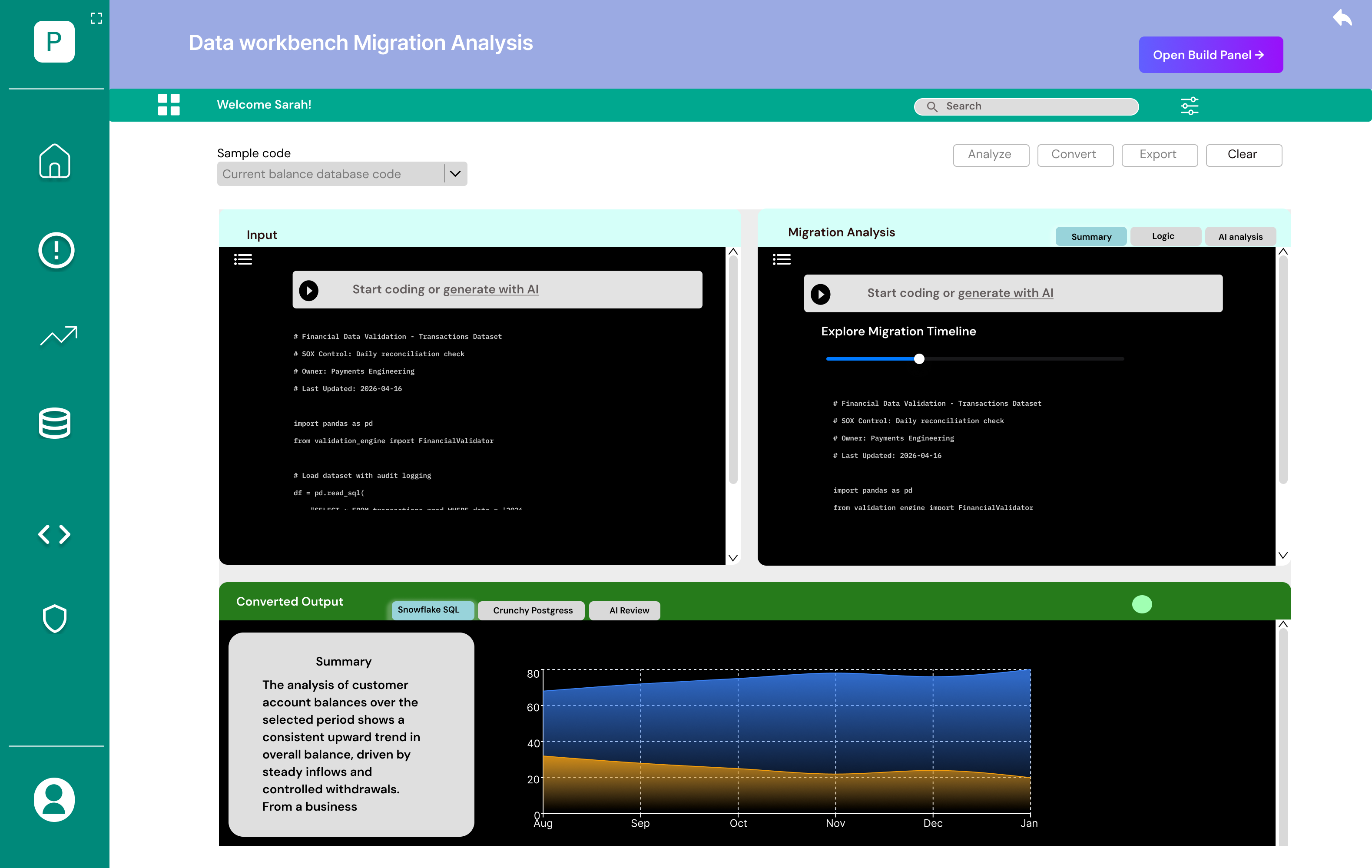
An AI copilot that helps bank data engineers untangle a billion-row merger — investigating issues, reconciling accounts, and migrating legacy code without ever leaving the flow.

ROLE
UX/UI Designer
TIMELINE
10 weeks
TOOLS
Figma · Miro
PLATFORM
Enterprise web app
northstar.workbench / production-hub
Data Workbench Production Hub dashboard

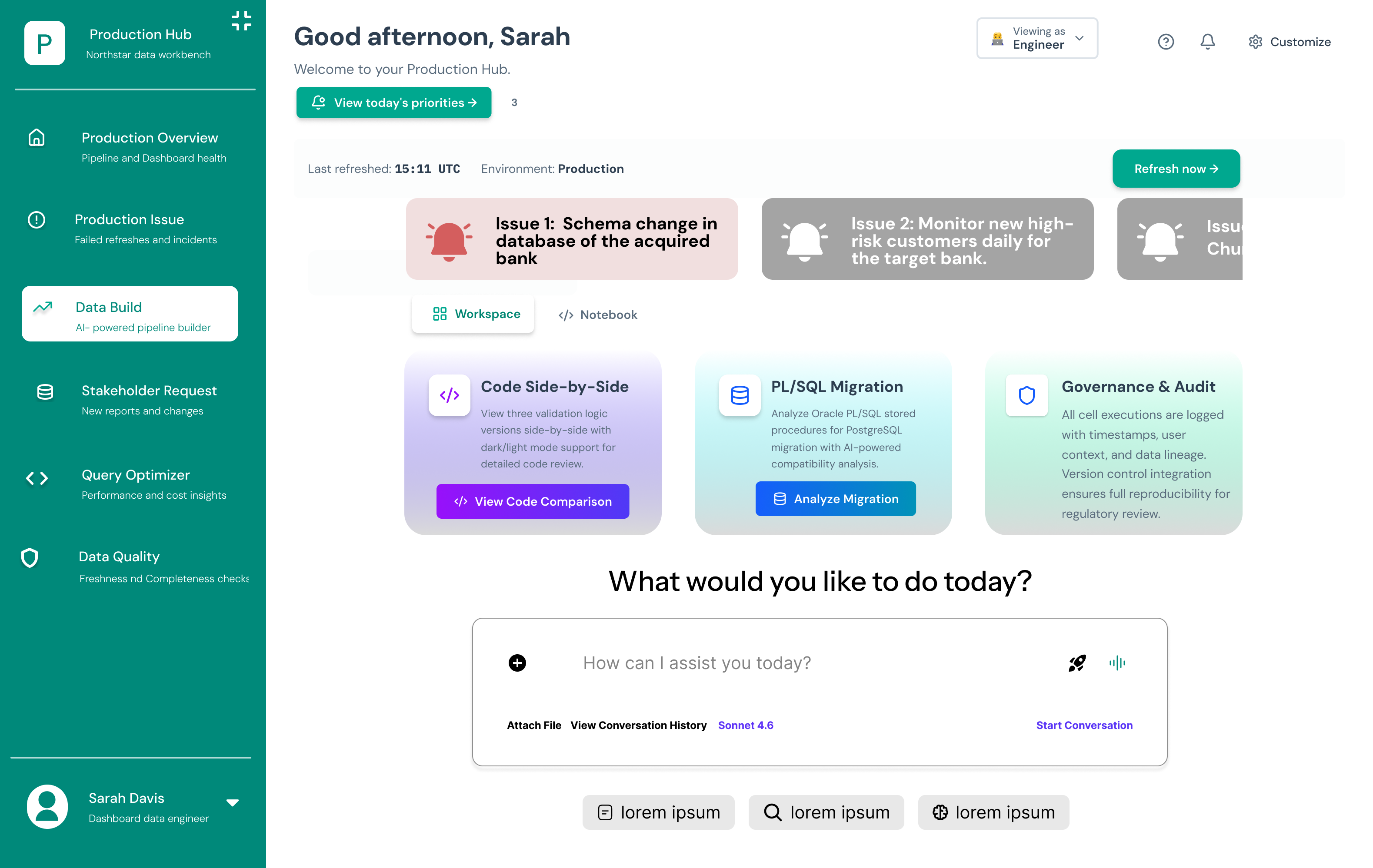
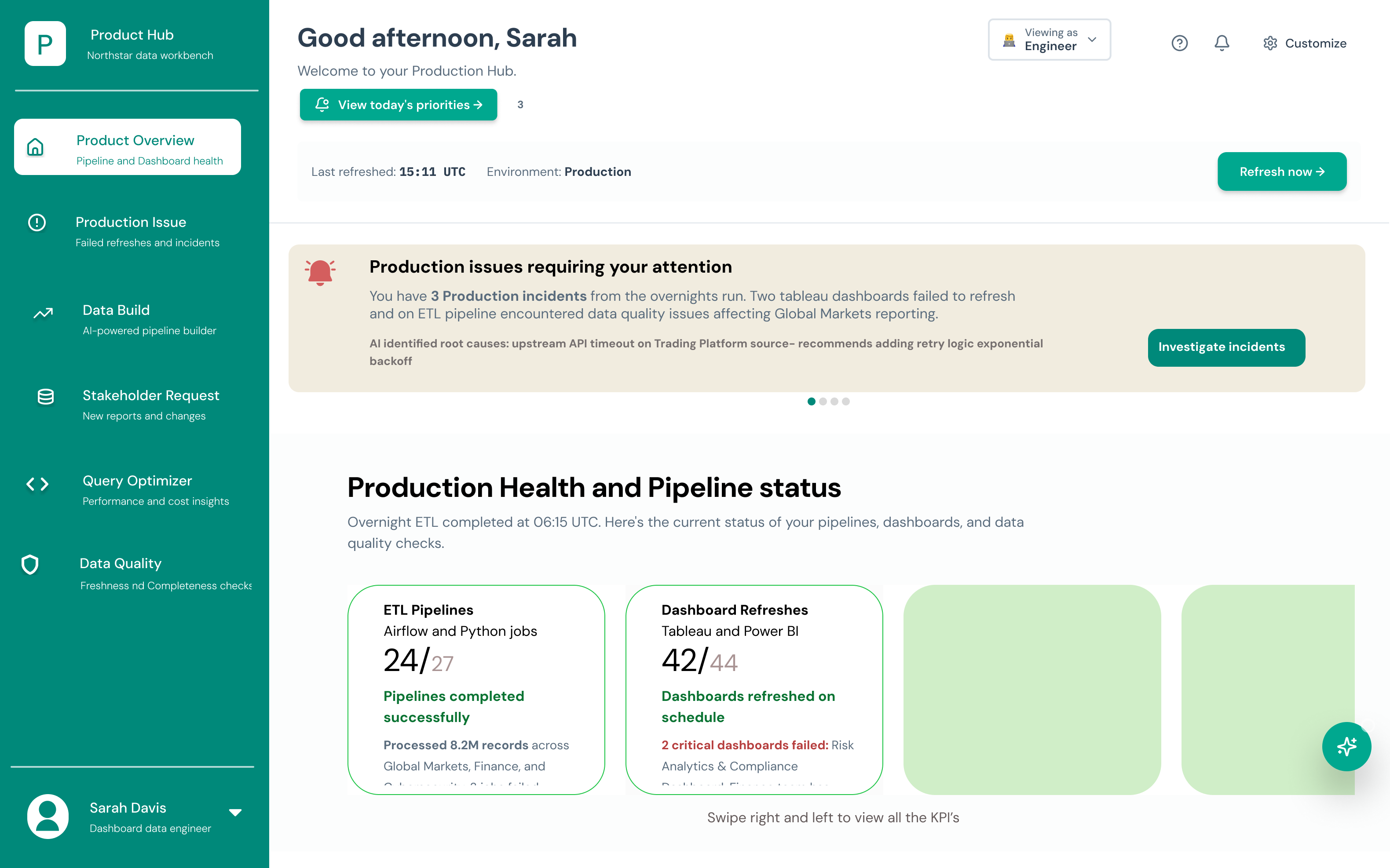
The Production Hub — an engineer's morning starts here, not in six different tabs.

00 — THE 30-SECOND VERSION

Most data tools were built for machines. This one was built for the person behind them.

When two banks merge, their data doesn't. I designed a workbench that lets a data engineer talk to their data, watch AI agents do the reconciliation grunt-work, and trust every answer because it shows its sources.

THE ASK

A proof-of-concept to show how AI could collapse a fractured post-merger data workflow into a single, calm surface.

WHAT I MADE

An agentic data workbench: production hub, conversational pipeline builder, multi-agent analysis, and traceable Q&A.

WHY IT MATTERS

It turns hours of cross-platform swiveling into a conversation — and makes the AI's reasoning auditable enough for a bank.

01 — THE CHALLENGE

When two banks merge, the data doesn't.

A Business Transformation team has just acquired another bank. Now millions of client records, accounts, and products from two completely different systems have to become one source of truth — without breaking a single balance.

The data engineers carrying that load were doing it with spreadsheets, swivel-chair tooling, and zero visibility into why things broke.

8.2M records

processed across Global Markets, Finance & Compliance every overnight run — where one renamed column quietly breaks 14 downstream pipelines.

01

Swivel-chair everything

Engineers jumped between the platform and third-party tools just to map one account structure to another.

02

Manual, blind reconciliation

Matching duplicate clients and reconciling balances was hand-done — slow, error-prone, and impossible to audit.

03

No trail of "why"

When a dashboard failed to refresh, root cause was a guessing game. In a regulated bank, that's a compliance risk.

02 — WHO I DESIGNED FOR

One engineer, holding the whole migration together.

SD
PRIMARY USER
Sarah Davis
  • // Dashboard data engineer
  • // Owns 27 ETL pipelines + 44 dashboards
  • // Fluent in SQL & Python, not in UI
  • // Judged on uptime & data quality
  • // Has 15 min before the 9am standup

Her real problem isn't the data. It's the context-switching.

Sarah doesn't need another dashboard — she needs the system to tell her what changed, why it broke, and what to do next, in language she can act on. Every tool that asks her to leave her workflow to find that out is a tool that's slowing the migration down.

So I designed around three questions she asks every single morning:

"What needs me today?" "What actually broke, and why?" "Can I trust this answer?"
03 — THE DESIGN BETS

Four principles that kept the AI useful — and honest.

The hard part of an AI tool for a bank isn't making it smart. It's making it trustworthy and calm. These were my guardrails.

BET 01

Hide complexity, not control

Abstract away the pipelines and PL/SQL — but always let the engineer see and override what the AI did.

BET 02

Conversation over configuration

If Sarah can describe it in plain English, she shouldn't have to build it in a form.

BET 03

Agents do the grunt work

Let specialized agents reconcile, validate and pattern-match — the human makes the call.

BET 04

Every answer shows its sources

No black boxes. Each insight cites the tables, queries and docs behind it — auditable by default.

04 — THE DESIGN PROCESS

From messy whiteboard to a workbench engineers trust.

I didn't start in Figma — I started with sticky notes, sketches and a lot of "wait, why does she even open this screen?" Here's how the workbench actually came together, the detours included.

Discover Define Sketch Evaluate Refine
PHASE 01

Discover

Weeks 1–3
  • Stakeholder + engineer interviews
  • Shadowed a real migration day
  • Mapped the 6-tool swivel-chair flow
Walked away withJourney map + pain inventory
PHASE 02

Define & Sketch

Weeks 4–7
  • Framed the "3 morning questions"
  • Crazy-8s + lo-fi paper wireframes
  • Information architecture for the hub
Walked away withLo-fi wireframes + IA
PHASE 03

Evaluate & Refine

Weeks 8–10
  • Heuristic evaluation pass
  • Applied Gestalt to the dashboard
  • Built the type scale + hi-fi UI
Walked away withHi-fi prototype
PHASE 02 · SKETCHING

Lo-fi first, so I could be wrong cheaply.

Before pixels, I sketched the three screens Sarah lives in. Paper let me throw away bad ideas in minutes — like an early version that buried incidents two clicks deep.

Production Hub
Incidents up top — what needs me today?
Ask the Data
Plain English in, not a config form
Agents at Work
Reasoning left · summary right
PHASE 03 · TYPE SYSTEM

A type scale that survives a 9am standup.

Data-dense screens punish weak hierarchy. I built a tight modular scale (1.25 ratio) in two type roles — Space Grotesk for everything human-facing, Space Mono for data, IDs and code — so Sarah can scan a screen in one pass.

DISPLAY / H1Grotesk · 40px · 700
line-height 1.04
Production Hub
SECTION / H2Grotesk · 28px · 600
Open incidents
CARD TITLE / H3Grotesk · 20px · 600
Schema change · billing_events
BODYGrotesk · 16px · 400
line-height 1.5
14 ETL pipelines are affected downstream. Review the AI's reconciliation before you approve.
DATA / MONOSpace Mono · 13px
tabular figures
job_id: 0xA4F2 · 126 failed_mappings · p=0.013
LABEL / METAMono · 11px · caps
letter-spacing 1.6px
LAST RUN · 02:14 AM
PHASE 03 · HEURISTIC EVALUATION

I graded my own work against Nielsen's 10.

Before hi-fi, I ran a heuristic evaluation on the wireframes. Three findings changed the design — here's what I caught and how I fixed it.

Visibility of system statusFIXED

The AI agents ran silently — Sarah couldn't tell if it was working or stuck.

→ Added live streaming reasoning + per-agent status so progress is always visible.

Match with the real worldFIXED

Early labels used internal system jargon ("ETL DAG node").

→ Rewrote in an engineer's language — "pipelines," "runs," "affected reports."

Error preventionFIXED

A migration could be run with zero confirmation — risky on a billion rows.

→ Added a compatibility review + diff step before any conversion executes.

Help users trust the AICORE

"Recognition rather than recall" — users shouldn't have to remember sources.

→ Every answer shows its SQL + cited tables inline, not in a hidden log.

PHASE 03 · GESTALT PRINCIPLES

Gestalt did the heavy lifting on the dashboard.

A data workbench can drown you in elements. Here's the real Production Hub — and the five Gestalt principles working underneath it to keep a dense screen calm and scannable.

The real Data Workbench Production Hub dashboard, annotated with Gestalt principles 2 5 3 1 4 6
1

Proximity

Each KPI card keeps its title, the 24/27 count and its status note tight together — so a card reads as one fact, not four scattered numbers.

2

Common region

The teal sidebar fences all navigation inside one shared field — Sarah instantly knows "this is where I move," separate from the work canvas.

3

Figure / ground

The beige "issues requiring your attention" banner lifts off the white page, pushing the most urgent thing into the foreground.

4

Similarity

The health cards share one identical layout, so the eye treats them as the same kind of thing and compares them at a glance.

5

Focal point

Teal is rationed. It only marks actions — "View today's priorities," "Refresh now" — so the primary move is never ambiguous.

6

Continuity

A single left-aligned edge runs greeting → priorities → alert → health, giving a calm top-down reading line through the whole screen.

05 — THE SOLUTION

Five moments in Sarah's day.

Rather than a feature tour, I designed the product as a narrative — the path from "something's wrong" to "it's handled, and I can prove it."

01

Start with a hub, not a haystack

The Production Hub greets Sarah with exactly what needs her: incidents triaged by AI, pipeline health, and a root-cause hypothesis already drafted — before she's finished her coffee.

production-hub / overview
Production Hub with prioritized incidents and AI assist panel
02

Ask in plain English

Instead of wiring a pipeline, Sarah types "list every ETL process affected by the schema change to billing_events." The workbench turns intent into action — and surfaces ready-made paths like code comparison and PL/SQL migration.

data-build / ask
Conversational AI-powered data build screen
03

Watch the agents think

Three specialized agents — Transaction Pattern, Asset Balance, Validation — work the problem in parallel, streaming their reasoning on the left and a structured summary on the right. The AI does the reconciliation; Sarah stays the decision-maker.

workspace / multi-agent-analysis
Multi-agent reasoning workspace with summary panel
14 impacted ETL jobs 126 failed mappings 5 downstream reports
04

Insights with evidence, not vibes

Findings come as hypotheses with confidence levels, sample sizes and p-values — the language a bank actually trusts. "Balances are misaligned after schema mapping" becomes a confirmed, measurable claim.

workspace / insights
Hypothesis and results panel with confidence metrics
05

Trust, built into every answer

Sarah asks a question in natural language; the workbench shows the exact SQL it ran and the sources it pulled from. Nothing is a black box — which is what makes an AI usable inside a regulated bank.

data-q&a / cited-answer
Data Q&A screen showing executed SQL and cited sources
+

Migrate legacy code without the dread

A side-by-side migration view converts Oracle PL/SQL to Snowflake or Postgres with an AI compatibility review and a timeline scrubber — so years of legacy logic don't have to be rewritten by hand.

migration-analysis / convert
Migration analysis with input, converted output and timeline
06 — THE OUTCOME

A concept sharp enough to fund the real thing.

As a proof-of-concept, success wasn't a shipped metric — it was conviction. The prototype gave stakeholders a tangible vision of an AI-native workbench worth investing in.

↓ TOOL SPRAWL

One surface

Collapsed incident triage, pipeline building, analysis, Q&A and migration into a single workbench instead of six tabs.

↑ TRUST

Auditable AI

Every AI output carries its SQL, sources and reasoning — clearing the bar for a regulated environment.

→ MOMENTUM

Bought-in vision

A walkthrough that let business stakeholders feel the future state and back deeper investment.

07 — WHAT I LEARNED

Designing for engineers taught me that calm is a feature.

The instinct with an AI product is to show how clever it is. The opposite was true here — Sarah trusted the workbench more when it did less talking and more showing: the SQL, the sources, the confidence. Restraint built credibility.

If I picked this up again, I'd pressure-test the agent hand-offs with real engineers and design the failure states — what the workbench says when an agent is wrong. That honesty is where enterprise trust is really won or lost.